 Choosing the perfect colours for your home may feel like a daunting task, but it doesn't have to be! The easiest way to begin is by finding a colour you love and creating a palette that works for your home. Follow our tips and tricks below to help narrow down your search and create a beautiful and trendy space.
- Look for inspiration.
- Find artwork or a furniture piece in your home that you love.
- Pick out colours from your artwork or furniture of choice.
- Bring your fabric or artwork to the paint store to find the suitable paint strips to match your colours. Take advantage of the different lighting options in-store to get an idea of how the colours look throughout the day.
- Narrow down your search to three colours, one neutral colour for the walls and two colours for furniture and accent pieces.
- Select colours from the colour spectrum.
- Paint stores have an infinite amount of colours. You can get a head start by eliminating specific colours on the colour spectrum.
- The colour spectrum consists of 7 colours: red, orange, yellow, green, blue, indigo, and violet.
- Choosing a few colours from the colour spectrum will reduce the number of paint chips you'll be looking at in the store and the number of paint samples you'll be bringing home.
- Match your colours to the mood you want to establish in each room.
- Every colour evokes emotional responses.
- Warmer colours, such as orange, red, and yellow, create more energy and drama in a room. These colours are best for social spaces in the home.
- Many designers suggest avoiding warm tones in children's bedrooms to prevent over-stimulation, irritability and unrest.
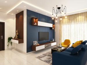
- Cooler colours, such as blue, green, and white, establish a restful and soothing feeling. It's better to use colours like these in a more private room, like a bedroom.
- Follow the colour wheel.
- The colour wheel can help you see how colours compliment and oppose each other. For instance, red and green are opposite and are most intense when used together.
- Using the wheel helps to visualize the temperature of each colour and the moods they establish.
- Colours that are side-by-side on the wheel, such as blue and green, are more casual and best for informal spaces.
- Apply the 60-30-10 rule to your space.
- The 60-30-10 rule is a very common designer tip when decorating your home.
- 60% of the colour in a room comes from the walls.
- The following 30% of colour comes from upholstery, rugs and carpets, and window treatments.
- The final 10% of colour is found in accent pieces, accessories, and artwork.
- Apply this rule when decorating to ensure you include splashes of colour in each room and that the neutral colour isn't overpowering.
- Pay close attention to lighting.
- A colour you absolutely adore in the paint store will likely appear differently in your home.
- Natural daylight shows the most accurate colour, whereas incandescent lighting brings out warmer tones and yellows.
- Fluorescent lighting adds a sharp blue tone to a space which can alter the appearance of any colour.
- Take a look at the undertones from other surfaces in the room, as they can change the way your paint appears.
- Avoid using a bold colour adjacent to a window, as the natural daylight will cause the colour to overpower. Instead, use the strong colour under indirect lighting or as an accent wall.
- Create flow throughout the house.
- Creating flow in the house is especially helpful for smaller homes, as they can appear larger with the proper colour flow.
- Select a neutral colour for the entire house and add accents in each room with some variety. For instance, if you have chosen a green tint to accent your space, perhaps place a green loveseat in one room and a green shelf or bookcase in the next room.
- When selecting colours for a specific room, make sure you consider the space outside that room. The colours of one room should complement the colours of the next room, especially if a door or archway is separating these spaces.
- If your home does not already have moulding, consider adding moulding throughout the house, as this helps tie your space together.
- Having a specific colour palette allows you to create spaces in your home that are cohesive.
- Play with visual effects.
- Paint comes in many different finishes, such as flat, satin (eggshell), semi- and high-gloss.
- Satin finishes are typically used for walls, whereas semi- or high-gloss finishes are best for trims and moulding to create a bit of an accent.
- Use these finishes to your advantage to create interesting visual effects in your space. For instance, you can use the same colour on your walls but use a flat finish on one wall and a semi-gloss finish on the adjacent wall. These different finishes create a velvet effect when the light hits the wall.
- Do more research.
- While using furniture, fabrics, and artwork in your home is your starting point for colour inspiration, you don't have to stop there!
- Use magazines, catalogues or Pinterest to create an inspiration board.
- Doing additional research is especially helpful for choosing colours that are in style, and that will make your home trendy.
- Be creative with your colour palette.
- Try to incorporate your colours in multiple different ways.
- This tip is most important for your neutral colours as you can use them in furniture pieces or decor, rather than simply on the walls.
- You can use this opportunity to give your bolder colours a chance to appear on the walls and use your neutrals in your furniture.
- Use colour to make your space feel bigger or cozier.
- Using brighter and lighter colours can make any space feel much bigger and open. Designers suggest using a crisp white to create a feeling of openness in your home.
- On the contrary, if you want to create a space that feels cozy and more intimate, try using dark colours and tones as they make surfaces feel closer than they are.
- Treat your ceiling like an additional wall.
- If you have lower ceilings, you can make them appear taller by painting them white along with the adjacent crown moulding.
- To make your room appear larger, designers suggest painting the ceiling a shade lighter than the shade on the walls. Doing so will soften the contrast between the walls and ceiling and give the room a larger appearance.
- Don't shy away from using the ceiling as an accent! Adding a bold colour on the ceiling can give your space some punch.
- Test your paint samples.
- Skipping this step can be a big mistake when selecting a colour for your home. You should never choose a colour directly from a paint chip.
- Get a sample of your paint colour from the store and paint a 4x4 foot area on your wall. Make sure you use two coats of paint.
- Take a look at the colour at different times of the day to see how it looks and feels over the course of three days.
- Another option is to paint your colour sample at ceiling level, eye level, and ground level. This will give you another perspective of how the colour looks from different angles.
- It's important to remember that each wall gets varying amounts of light. If possible, paint your sample on more than one wall to get an overall idea of how the colour will look.
- Make it personal.

- Any colour can look fabulous in your home as long as it suits your style.
- If you aren't sure about a good accent colour, take a look at your clothes.
- Style your room with colours that flatter you. For instance, if you enjoy wearing denim, perhaps try adding a dramatic blue to give your room a pop of colour.
- Shift from dark to light as you move vertically.
- When decorating your home, you can incorporate darker colours near the floor and lighten your colours as you move towards the ceiling.
- This colour scheme replicates the world outside and is meant to create a restful and relaxing feeling.
- Use a monochromatic colour scheme.
- Monochromatic colour schemes are best for smaller rooms, such as a bathroom or powder room.
- Choose a single colour and balance it with white walls and floors to prevent the colour from overpowering the space.
- Use variations of your colour of choice through different tones or finishes to add contrast.
- Ask a colour consultant.
- Colour consultants can provide you with new colour ideas or even a custom colour palette for your home.
- Before meeting a colour consultant, put together an inspiration board to ensure you get the colours you desire.
- The consultant may also suggest making changes to the lighting in your home to ensure there are no problems with colour.
- Use a paint colour app.
- There are many apps on your phone or tablet available to help you choose the right colour.
- Technology nowadays can help you match any colour you see anywhere by simply taking a picture. These apps can also suggest similar colours, tones or even a whole palette based on the colours in the picture.
- These apps also offer additional tools and tips for buying paint and simple DIY videos.
- Try a shade darker or lighter.
- If you find a colour that you really like, try it in different shades!
- Try using a darker shade as an accent wall to add a focal point to your space.
- Darker and lighter shades also allow you to create designs on your walls, such as stripes.
- Add metallic decor to give your space a nice finish.
- Take advantage of decorative finishes to add visual texture to your room.
- Using decorative pieces with metallic finishes such as copper, bronze, silver, or gold will provide depth and texture.
- If available to you, add a timeless piece to your decor. Black, white, and gold are always in style. Adding a timeless piece is sure to give your space a chic look.